Piecemeal to Full-course: Design System for Beli
Piecemeal to Full-course: Design System for Beli
Building design system from scratch for a restaurant tracking and review mobile app to resolve inconsistencies and improve accessibility.
Building design system from scratch for a restaurant tracking and review mobile app to resolve inconsistencies and improve accessibility.


Timeline
Timeline
10 weeks (Feb - Apr 2025)
10 weeks (Feb - Apr 2025)
10 weeks (Feb - Apr 2025)
Team Members
Team Members
3 fellow Pratt Institute graduate Students
3 fellow Pratt Institute graduate Students
3 fellow Pratt Institute graduate Students
My Role
My Role
UI Kit & Documentation, User Testing, Pitch Deck Creation
UI Kit & Documentation, User Testing, Pitch Deck Creation
UI Kit & Documentation, User Testing, Pitch Deck Creation
The Challenge:
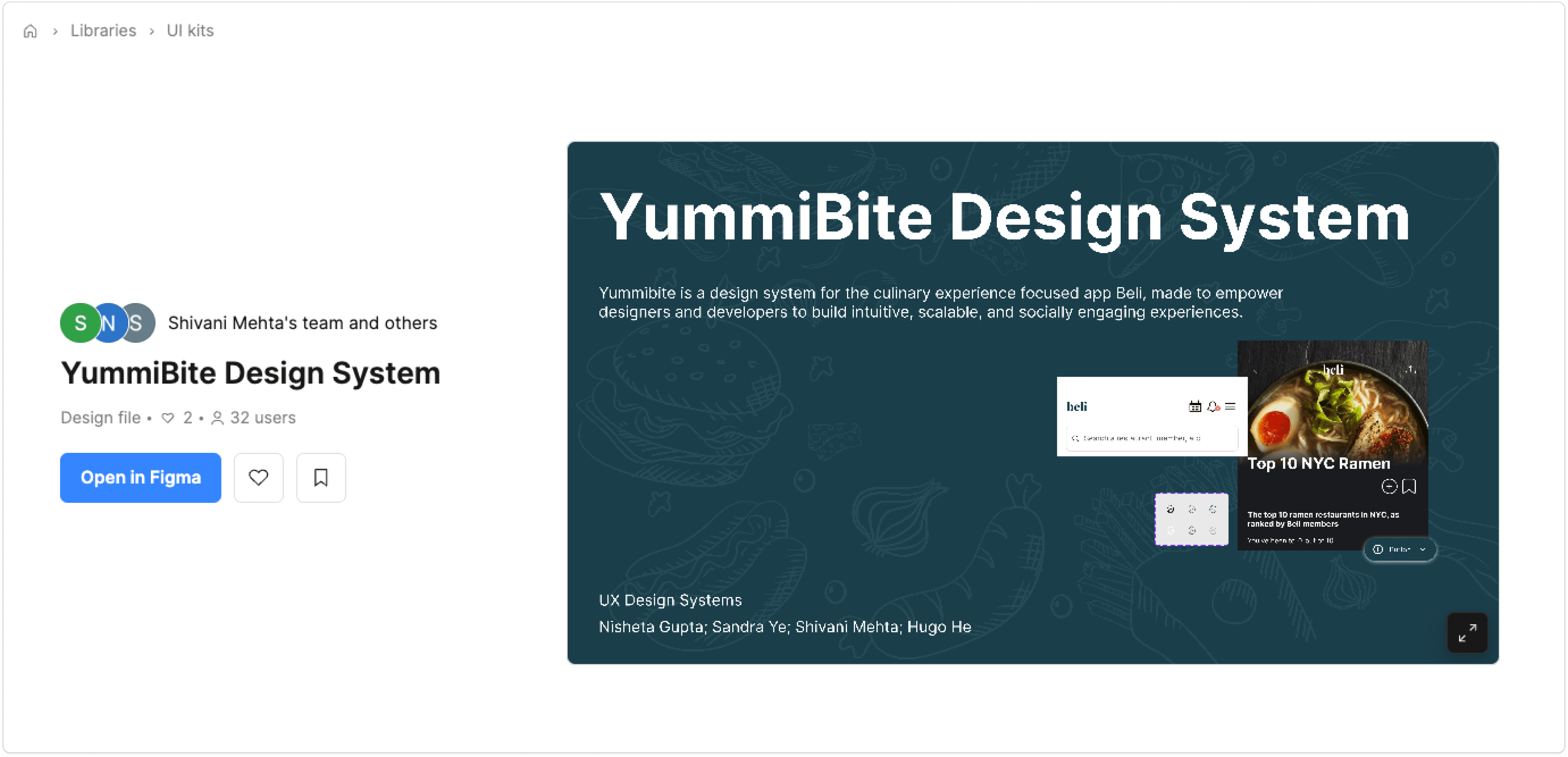
Beli is an mobile app that has captured the appetites of food lovers in NYC. It allows users to keep organized lists and maps, connect with friends about their favorite restaurants, and discover more gems through personalized recommendations and top lists.
Our team loved the app, but considered it a subpar user experience.
Upon UI audit, we found inconsistencies across screens, interactive components, and visual styles that can increase cognitive load, confuse users and make Beli’s features harder to discover.
Solution:
YummiBite! A design system for Beli that addresses existing usability issues whilst also providing more guidance for internal team, allowing for easy feature expansion.
The Challenge:
Beli is an mobile app that has captured the appetites of food lovers in NYC. It allows users to keep organized lists and maps, connect with friends about their favorite restaurants, and discover more gems through personalized recommendations and top lists.
Our team loved the app, but considered it a subpar user experience.
Upon UI audit, we found inconsistencies across screens, interactive components, and visual styles that can increase cognitive load, confuse users and make Beli’s features harder to discover.
Solution:
YummiBite! A design system for Beli that addresses existing usability issues whilst also providing more guidance for internal team, allowing for easy feature expansion.
Taking It Apart Before Putting It Together: Deconstructing Current Design
To understand existing design and preparing ourselves for creating a design system, we began by conducting an audit of the current app.
As some of our team members were expert users while others had not used the app before, we took advantage of this diversity and focused on 2 user flows: onboarding for new users and a survey of main functions for expert users.
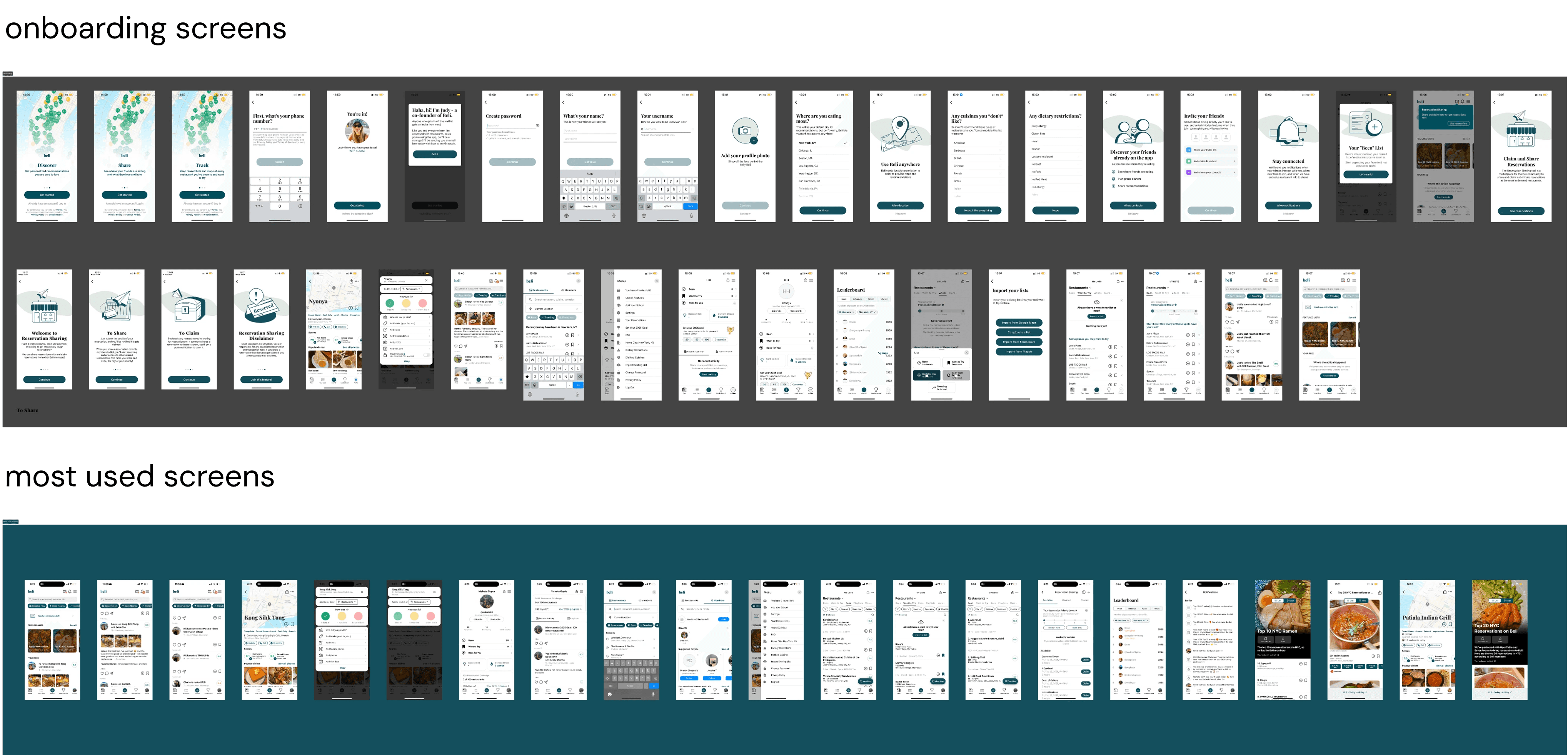
By deconstructing these screens (pages), we extracted and identified key templates, organisms, molecules, and atoms that comprise the current UI. These insights then informed us as we then built our design system from the ground up, following the methodology in Atomic Design.

Source: https://bradfrost.com/blog/post/atomic-web-design/
A lot of Screens but no tools to inspect…
Given that we do not have direct access to Beli’s existing design system and cannot use the inspect function in a mobile app, it was difficult for us to obtain accurate measurements of the exact design elements used.
To overcome this:
We made sure all audited screenshots are of the same dimension: iPhone 16 (393x852), so that we are deconstructing with consistent sizing.
We also used color pickers in Figma to obtain the HEX codes of the colors used, and confirmed within the team to ensure consistency in our work.
By deconstructing these screens (pages), we extracted and identified key templates, organisms, molecules, and atoms that comprise the current UI. These insights then informed us as we then built our design system from the ground up, following the methodology in Atomic Design.
Source: https://bradfrost.com/blog/post/atomic-web-design/
A lot of Screens but no tools to inspect…
Given that we do not have direct access to Beli’s existing design system and cannot use the inspect function in a mobile app, it was difficult for us to obtain accurate measurements of the exact design elements used.
To overcome this:
We made sure all audited screenshots are of the same dimension: iPhone 16 (393x852), so that we are deconstructing with consistent sizing.
We also used color pickers in Figma to obtain the HEX codes of the colors used, and confirmed within the team to ensure consistency in our work.

We identified inconsistencies in the following aspects:
We discovered 10+ button styles used across the app, the overwhelming variety may be disruptive to the user experience.
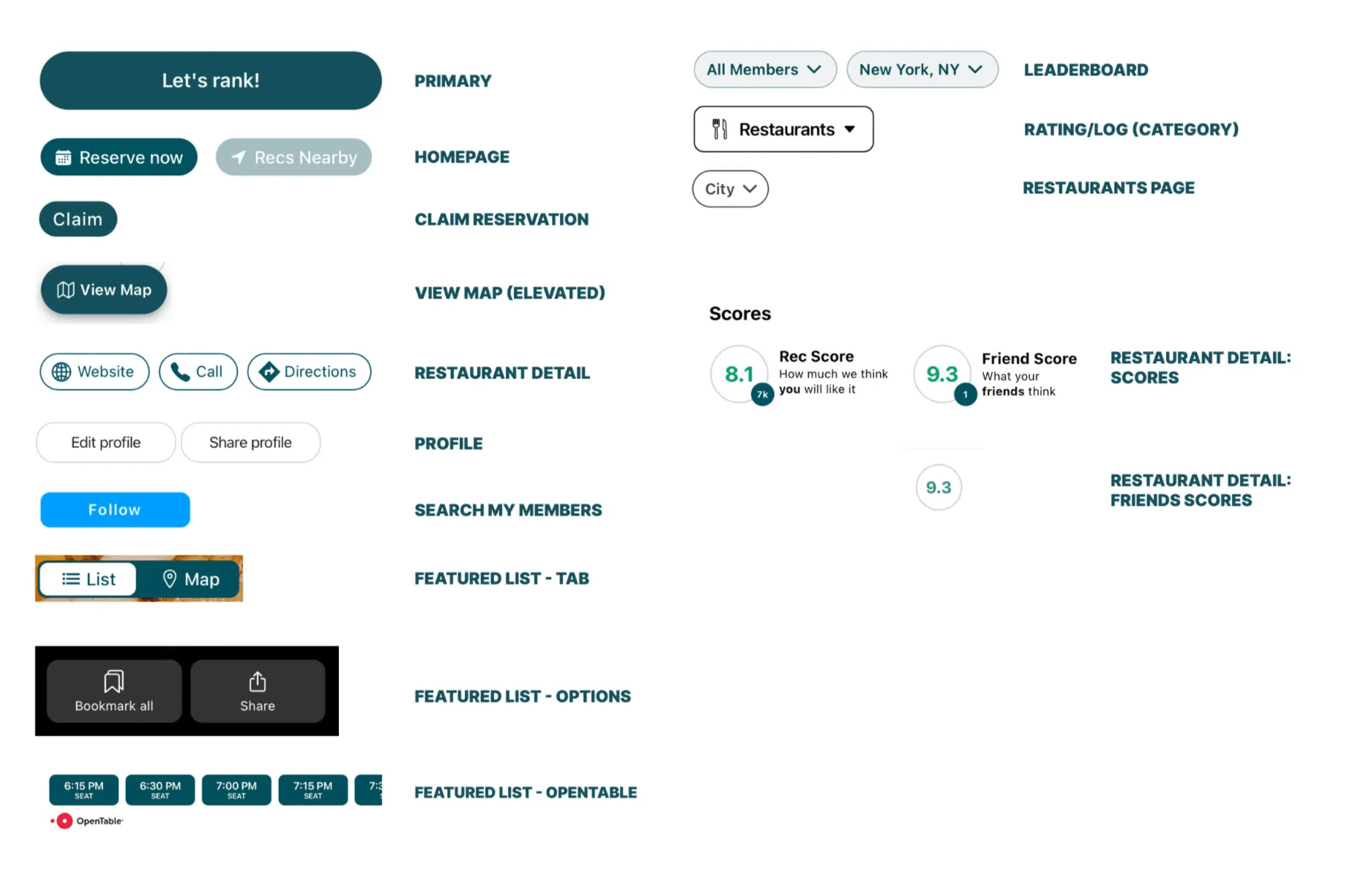
Buttons with the same visual style trigger different interactions, which can also be confusing for users.
Various neutral shades are identified in the Beli app. Upon further inspection, we noticed that they have different color undertones and are also randomly used. Our accessibility test also showed that many color pairings are not compliant with WCAG AAA standard.
We identified inconsistencies in the following aspects:
We discovered 10+ button styles used across the app, the overwhelming variety may be disruptive to the user experience.
Buttons with the same visual style trigger different interactions, which can also be confusing for users.
Various neutral shades are identified in the Beli app. Upon further inspection, we noticed that they have different color undertones and are also randomly used. Our accessibility test also showed that many color pairings are not compliant with WCAG AAA standard.


In the Making: Redesign the System Based on Insights
Knowing that alignment among team members would be critical for our goal of creating a design system, our first step was to determine the design principles to orient ourselves.

Foundation
As our top priority, we standardized foundational elements that underlie every design. These include Color, Typography, and Layout.
With fewer neutral colors, the new color palette can strengthen visual consistency whilst still providing sufficient options for designers. In our documentation, we also provided graphic and textual guidance, providing designers the freedom to create new color pairings whilst also ensuring accessibility.
In the Making: Redesign the System Based on Insights
Knowing that alignment among team members would be critical for our goal of creating a design system, our first step was to determine the design principles to orient ourselves.
Foundation
As our top priority, we standardized foundational elements that underlie every design. These include Color, Typography, and Layout.
With fewer neutral colors, the new color palette can strengthen visual consistency whilst still providing sufficient options for designers. In our documentation, we also provided graphic and textual guidance, providing designers the freedom to create new color pairings whilst also ensuring accessibility.

Our newly standardized typescale is tailored to mobile use and communicates clear information hierarchy.

We also created relevant guidelines for margin and spacing following conventions in mobile UI design.
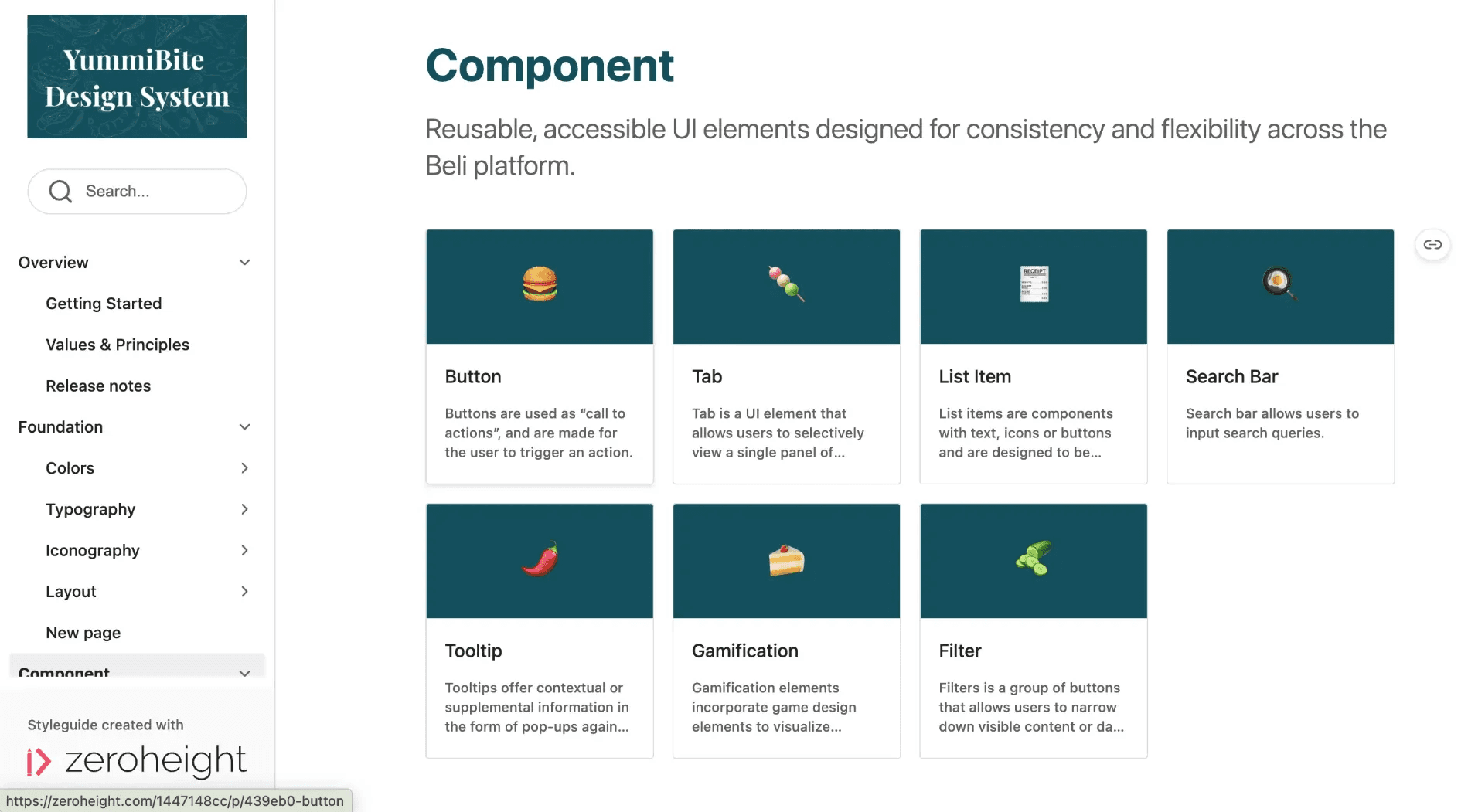
Components
With the foundation set in place, we then created a library of reusable UI elements designed for consistency and flexibility across the Beli app. We prioritized elements that are most commonly used and eliminated inconsistencies by creating a distinct visual style as well as documenting guidelines that specify use cases.
In our Figma UI kit, components are shown on separate pages and named as well as sectioned to reflect specific usage.
Our newly standardized typescale is tailored to mobile use and communicates clear information hierarchy.
We also created relevant guidelines for margin and spacing following conventions in mobile UI design.
Components
With the foundation set in place, we then created a library of reusable UI elements designed for consistency and flexibility across the Beli app. We prioritized elements that are most commonly used and eliminated inconsistencies by creating a distinct visual style as well as documenting guidelines that specify use cases.
In our Figma UI kit, components are shown on separate pages and named as well as sectioned to reflect specific usage.

In our documentation, we also reserved an overview page for components such that users can quickly navigate to learn more about the specific component by glancing at the descriptions.
All components are designed in consideration of customizability and usability. Designers are free to adjust the components through the properties panel.
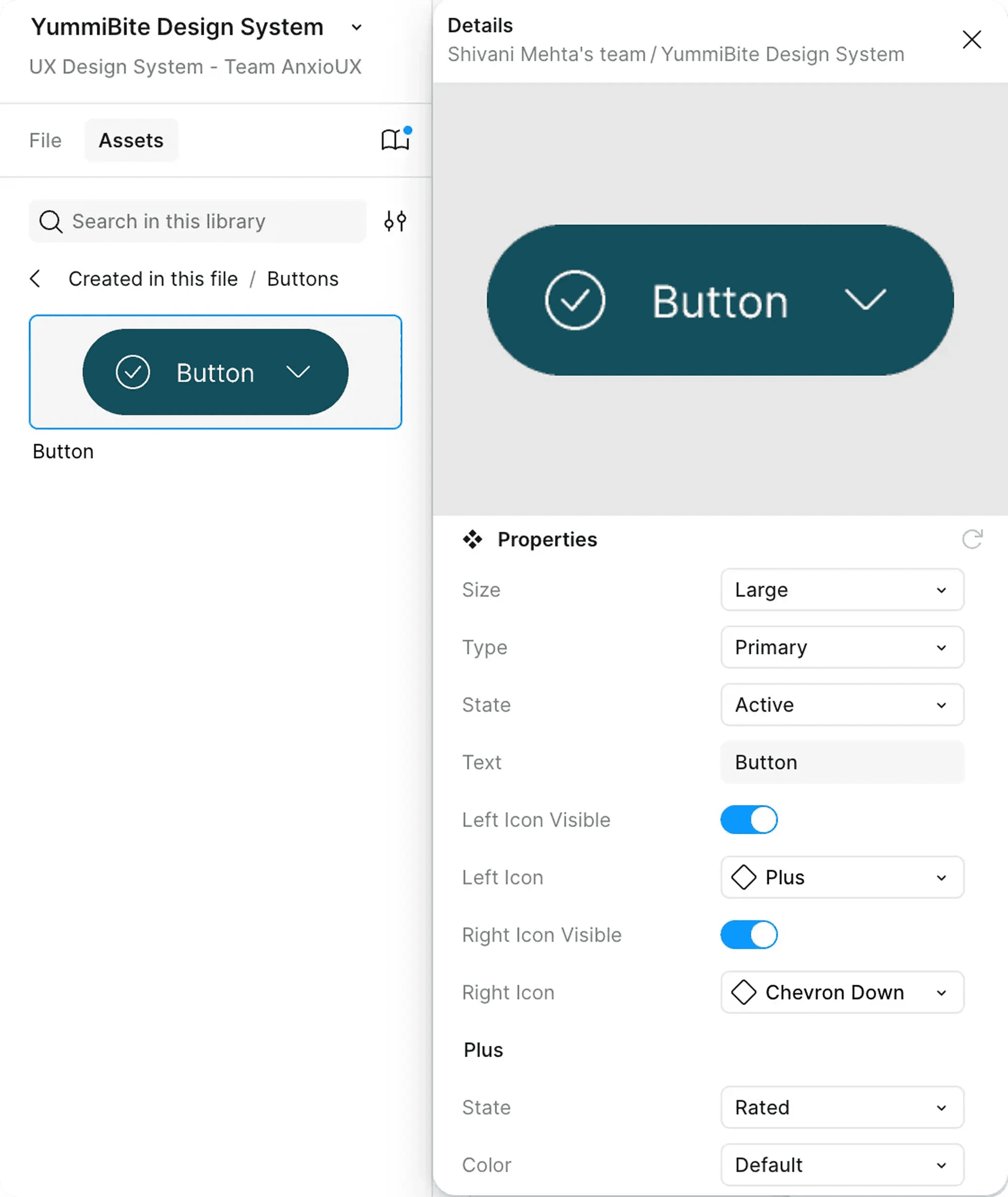
If they would like to make more significant edits, they can also contact the design system team via instructions provided in our documentation.
In our documentation, we also reserved an overview page for components such that users can quickly navigate to learn more about the specific component by glancing at the descriptions.
All components are designed in consideration of customizability and usability. Designers are free to adjust the components through the properties panel.
If they would like to make more significant edits, they can also contact the design system team via instructions provided in our documentation.

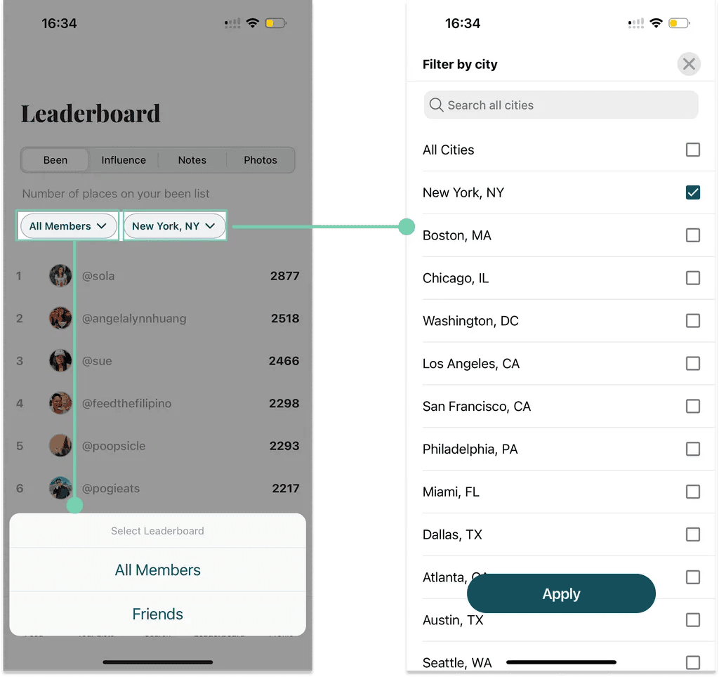
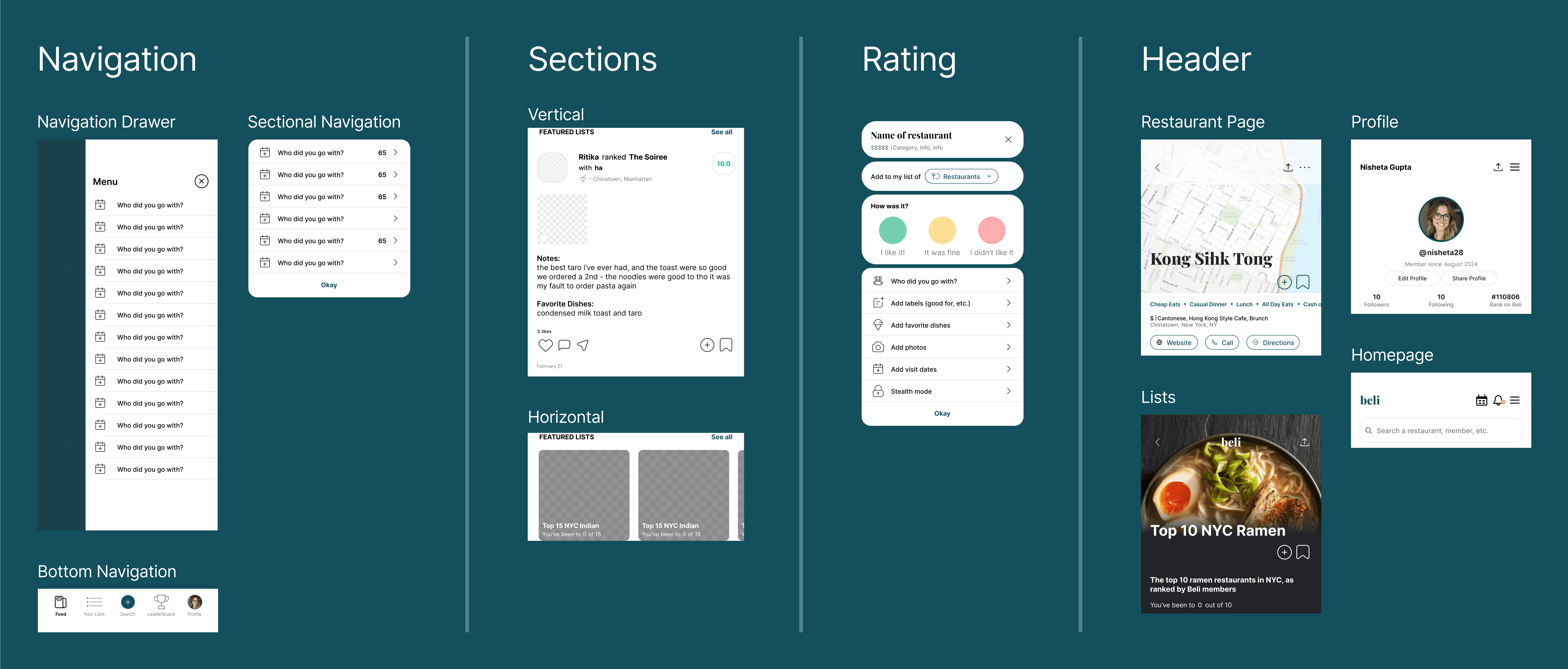
Templates
To further reinforce our focus on consistency, we created templates for interactive elements that are critical to Beli’s main functionalities and are most commonly used by users.
User Testing and Socialization
As a team, we had conducted preliminary user testing to validate some of our organizational decisions. Inputs from our fellow designers were very constructive and directly influenced our addition of the templates.
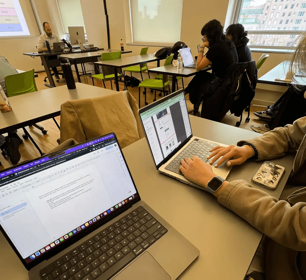
As a practice, we also gave a pitch to our Design System class to convey our design vision and anticipated impact.
Templates
To further reinforce our focus on consistency, we created templates for interactive elements that are critical to Beli’s main functionalities and are most commonly used by users.
User Testing and Socialization
As a team, we had conducted preliminary user testing to validate some of our organizational decisions. Inputs from our fellow designers were very constructive and directly influenced our addition of the templates.
As a practice, we also gave a pitch to our Design System class to convey our design vision and anticipated impact.

What I learned
📌 It takes a lot of ALIGNMENT to build a design system.
Be it naming components or organizational logic, designers can have differing perspectives on details that are critical for the design system. Investing time up front to reach consensus could have saved significant effort spent on rework later.
🕔 Design system adoption takes TIME, RESOURCES, and PERSUASION.
The effort of creating the design system itself was quite an undertaking for our team. I imagine gaining organizational support is just as challenging. It will take more than a pitch deck and has to match the current needs of the company.
📎 DOCUMENTATION (for design and beyond) should not be overlooked.
Our team was quick to build the UI kit, but struggled to organize the components. This was resolved naturally as we moved to creating documentation. Writing out how to use each component helped clarify our decisions and categorize components by use case. In general, writing proved invaluable in reflecting and assessing.
A huge thank you to my teammates, Professor Craig MacDonald, and others in our Design System class that provided meaningful feedback to our work!
A huge thank you to my teammates, Professor Craig MacDonald, and others in our Design System class that provided meaningful feedback to our work!