brevv: A Mobile App for Your Coffee Journey & Discovery
brevv: A Mobile App for Your Coffee Journey & Discovery
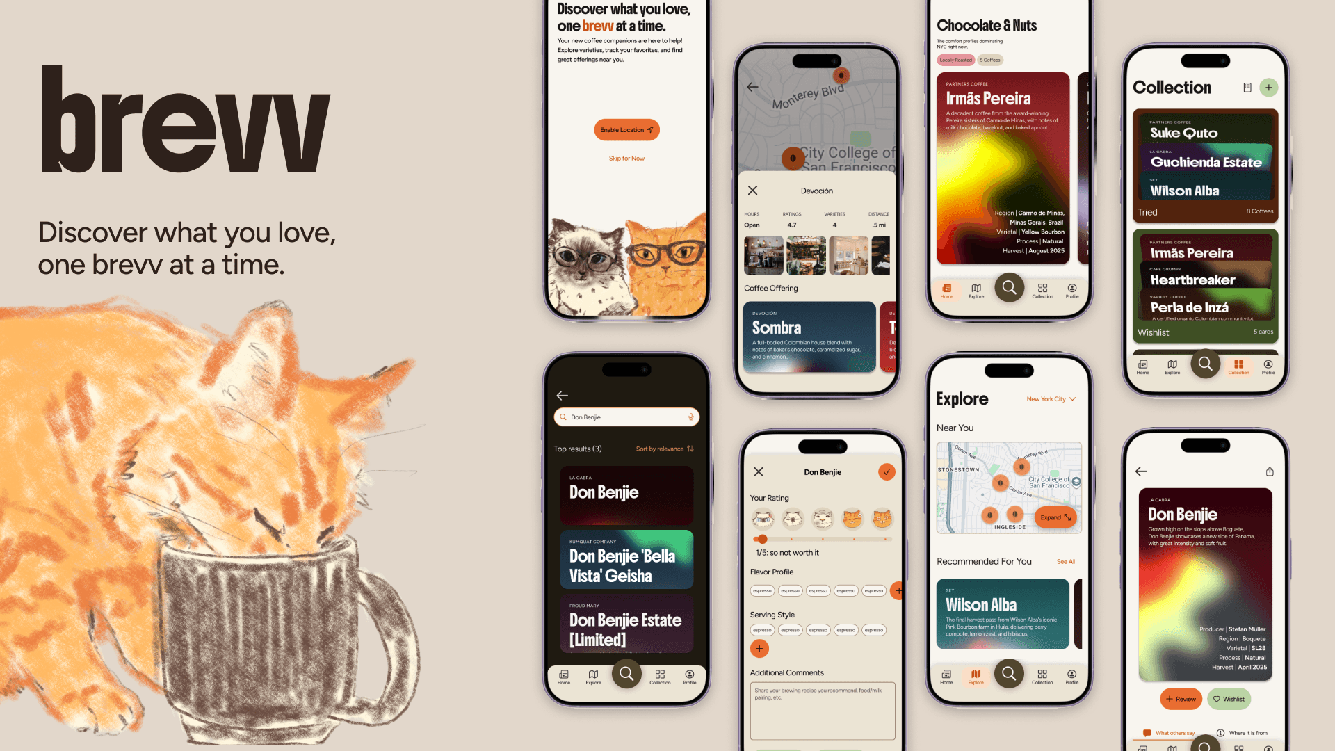
End-to-end UX and visual design for a mobile coffee discovery app, making specialty coffee approachable and fun. Currently in development.
End-to-end UX and visual design for a mobile coffee discovery app, making specialty coffee approachable and fun. Currently in development.
Timeline
Timeline
12 weeks (Feb - May 2026)
12 weeks (Feb - May 2026)
12 weeks (Feb - May 2026)
My Role
My Role
Solo Product Designer
Solo Product Designer
Solo Product Designer
The Challenge:
Specialty coffee is a growing market (47.8 billion in 2024) as we see an increasing appreciation for high-quality and ethically produced coffee. Yet, there is no dedicated app for coffee enthusiasts to discover, track, and share their knowledge and journey all in one place.
The solution:
brevv, the lightweight, short and sweet solution packing a lot of features and personality!
I Delivered:
A high-fidelity mobile prototype with onboarding, multi-format discovery, an interactive coffee card system, community-sourced reviews, and more functionalities.
Presented to industry judges from Meta, Google, and Bank of America, who called out the visual identity and research as standout strengths.
Currently being built into a working app by the designer.
The Challenge:
Specialty coffee is a growing market (47.8 billion in 2024) as we see an increasing appreciation for high-quality and ethically produced coffee. Yet, there is no dedicated app for coffee enthusiasts to discover, track, and share their knowledge and journey all in one place.
The solution:
brevv, the lightweight, short and sweet solution packing a lot of features and personality!
I Delivered:
A high-fidelity mobile prototype with onboarding, multi-format discovery, an interactive coffee card system, community-sourced reviews, and more functionalities.
Presented to industry judges from Meta, Google, and Bank of America, who called out the visual identity and research as standout strengths.
Currently being built into a working app by the designer.
Design Questions:
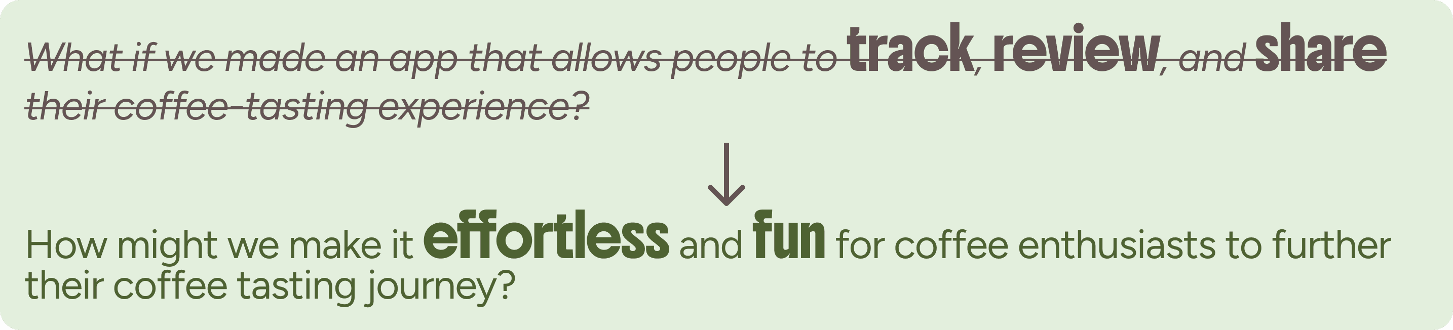
The initial focus was entirely on tracking, which came from my personal observation. Research revealed that users were less motivated by tracking personal finds alone and instead more drawn to the idea of discovery and building understanding over time.
This led us to reframe around making the mobile app experience approachable and fun, supporting multiple entry points into the coffee journey rather than a single use case.
Design Process:
Design Questions:
The initial focus was entirely on tracking, which came from my personal observation. Research revealed that users were less motivated by tracking personal finds alone and instead more drawn to the idea of discovery and building understanding over time.
This led us to reframe around making the mobile app experience approachable and fun, supporting multiple entry points into the coffee journey rather than a single use case.
Design Process:

Research
1. What do coffee enthusiasts actually want from a digital tool?
Specialty coffee has always been a big part of my social life. I loved the physical cards at cafes that broke down flavor notes and origins, but they were easy to lose; the information tends to be inconsistent across shops, making it difficult to organize over time. That personal frustration led me to ask: was this a shared problem?
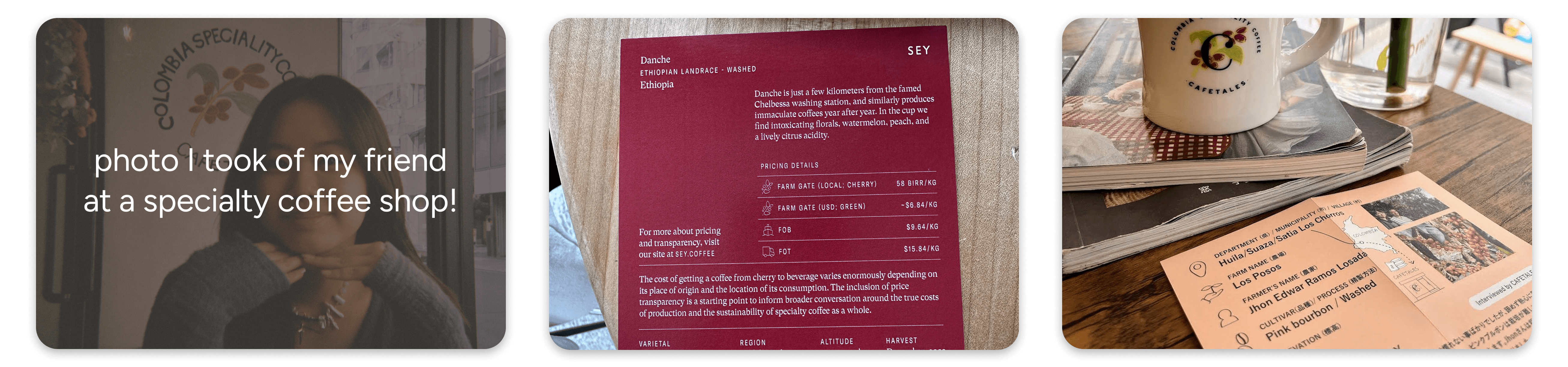
To find out, I designed and distributed physical survey flyers at local NYC coffee shops, and posted digitally across Reddit (r/Bushwick, r/Greenpoint, r/pourover, etc), Discord, and school networks. The survey collected 73 responses and screened for highly engaged enthusiasts, yielded 41 qualifying responses.
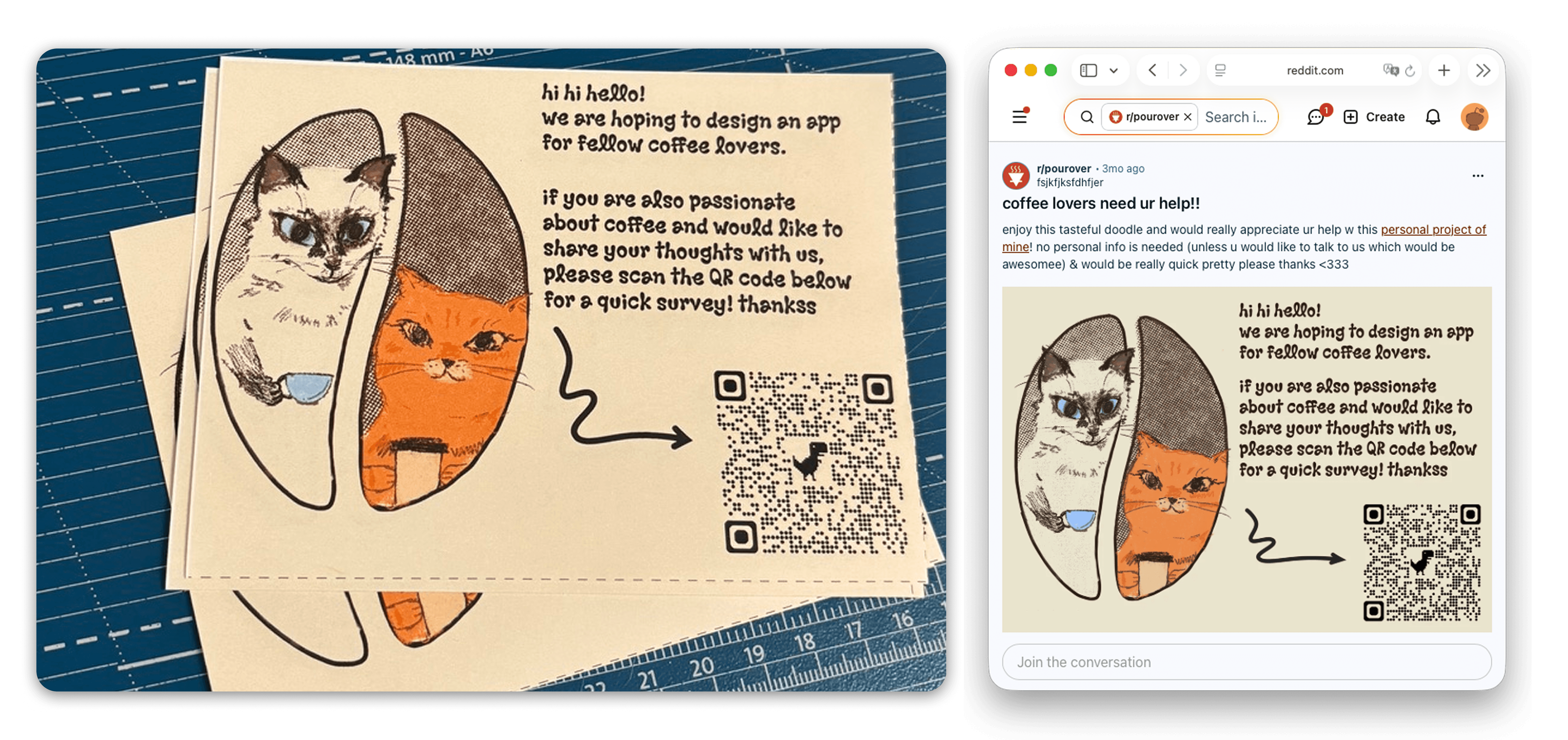
From there, I reached out to participants who rated their coffee expertise highly and were open to a conversation, landing 9 in-depth interviews. All survey and interview data was synthesized into an affinity map to surface patterns.
Research
1. What do coffee enthusiasts actually want from a digital tool?
Specialty coffee has always been a big part of my social life. I loved the physical cards at cafes that broke down flavor notes and origins, but they were easy to lose; the information tends to be inconsistent across shops, making it difficult to organize over time. That personal frustration led me to ask: was this a shared problem?
To find out, I designed and distributed physical survey flyers at local NYC coffee shops, and posted digitally across Reddit (r/Bushwick, r/Greenpoint, r/pourover, etc), Discord, and school networks. The survey collected 73 responses and screened for highly engaged enthusiasts, yielded 41 qualifying responses.
From there, I reached out to participants who rated their coffee expertise highly and were open to a conversation, landing 9 in-depth interviews. All survey and interview data was synthesized into an affinity map to surface patterns.
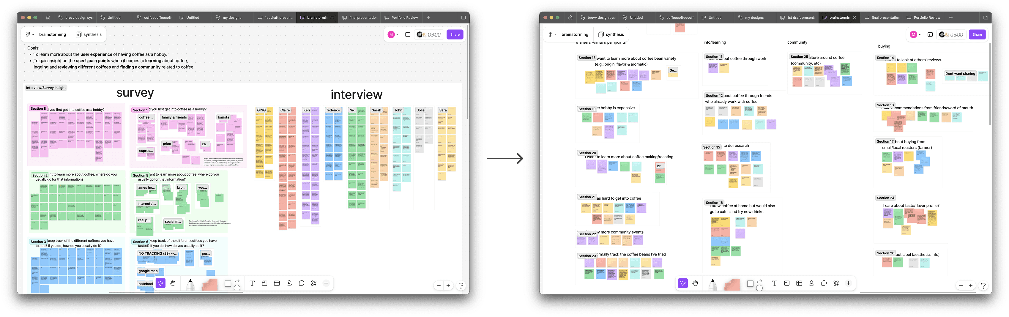
Three core user needs emerged.

What to design and what to leave out?
Research also helped define scope boundaries and determine what to not design for:

To the original research question of tracking, I found that:
Most people do NOT track their experience with coffee currently, but are very interested in doing so provided an easy way.
This made me realize that tracking is not a primary value proposition. Instead, discovery and education emerged as a stronger pull for users as many people expressed the wish to find new coffees and cafes near them, learn what they are tasting, and see what others say.
The product then shifted to focus on building multiple pathways of discovery while letting tracking happen naturally as a byproduct of engaging with the app.
Ideation
User Persona and Journey
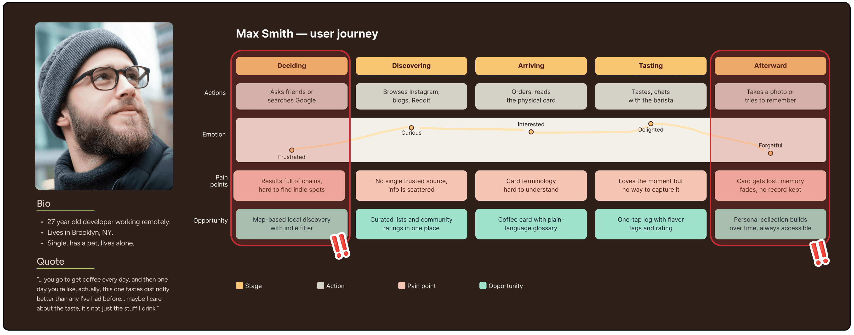
Persona was built directly from interview data, and mapping user journey helped pinpoint where friction was highest: particularly the moment of discovery at a cafe and the gap that followed when users had no way to capture or revisit that experience.
Three core user needs emerged.
What to design and what to leave out?
Research also helped define scope boundaries and determine what to not design for:
To the original research question of tracking, I found that:
Most people do NOT track their experience with coffee currently, but are very interested in doing so provided an easy way.
This made me realize that tracking is not a primary value proposition. Instead, discovery and education emerged as a stronger pull for users as many people expressed the wish to find new coffees and cafes near them, learn what they are tasting, and see what others say.
The product then shifted to focus on building multiple pathways of discovery while letting tracking happen naturally as a byproduct of engaging with the app.
Ideation
User Persona and Journey
Persona was built directly from interview data, and mapping user journey helped pinpoint where friction was highest: particularly the moment of discovery at a cafe and the gap that followed when users had no way to capture or revisit that experience.
Defining Features
My teammate and I used a combination of methods to brainstorm and narrow down the feature set. Mindmapping and SCAMPER helped us generate ideas broadly, while MoSCoW gave us a framework to prioritize and prevent scope creep. To draw influence from existing products, we ran lightning demos referencing apps we found compelling, followed by a competitive analysis across 3 coffee apps(coffee mood, bean conqueror, and filtru) and 2 indirect competitors (Untappd and Yelp).
Defining Features
My teammate and I used a combination of methods to brainstorm and narrow down the feature set. Mindmapping and SCAMPER helped us generate ideas broadly, while MoSCoW gave us a framework to prioritize and prevent scope creep. To draw influence from existing products, we ran lightning demos referencing apps we found compelling, followed by a competitive analysis across 3 coffee apps(coffee mood, bean conqueror, and filtru) and 2 indirect competitors (Untappd and Yelp).
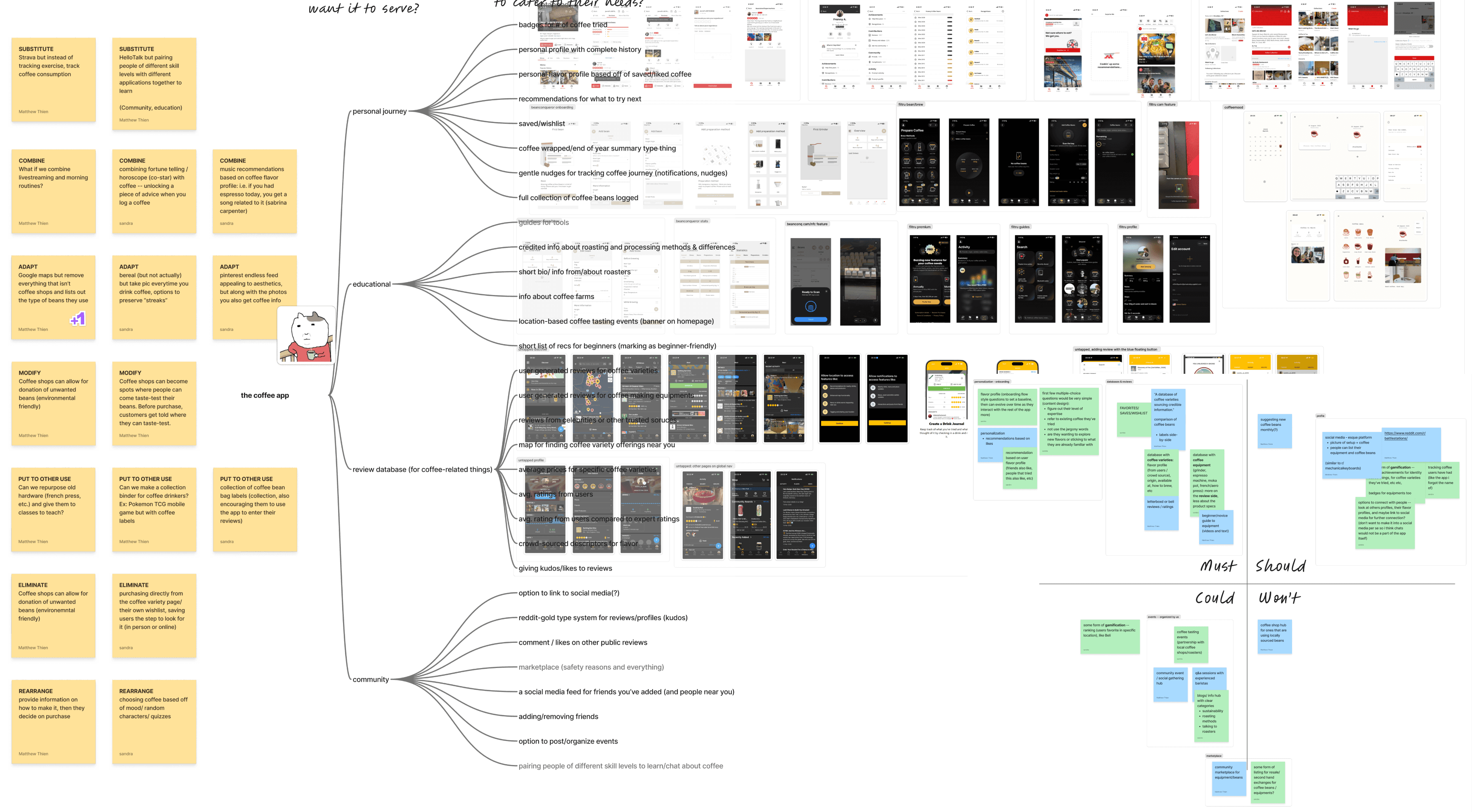
That analysis confirmed the gap: no existing tool combined coffee-specific depth with the social and location features users actually wanted.
Low to Mid-Fidelity Sketching
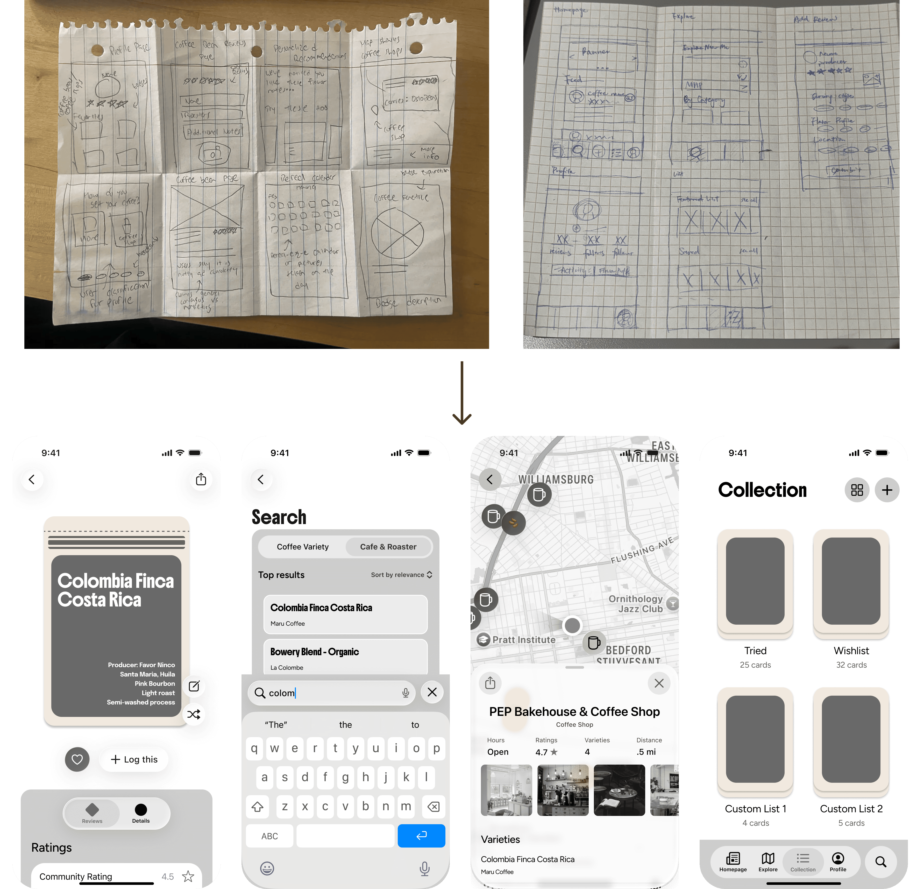
Before opening any design tool, I ran pen and paper sketching sessions with my teammate to explore layouts and interaction patterns quickly and without commitment. Sketches were then brought into mid-fidelity to better visualize the information architecture and pressure-test the structure before moving forward.
That analysis confirmed the gap: no existing tool combined coffee-specific depth with the social and location features users actually wanted.
Low to Mid-Fidelity Sketching
Before opening any design tool, I ran pen and paper sketching sessions with my teammate to explore layouts and interaction patterns quickly and without commitment. Sketches were then brought into mid-fidelity to better visualize the information architecture and pressure-test the structure before moving forward.
Setting Visual Identity
brevv's visual identity is rooted in the physical coffee cards that inspired the project: warm, tactile, and approachable. The color palette draws from coffee plants and cherries, with each tone named after a coffee variety, paired with a high-personality display typeface (Boldonse) and expressive body typeface (Figtree).
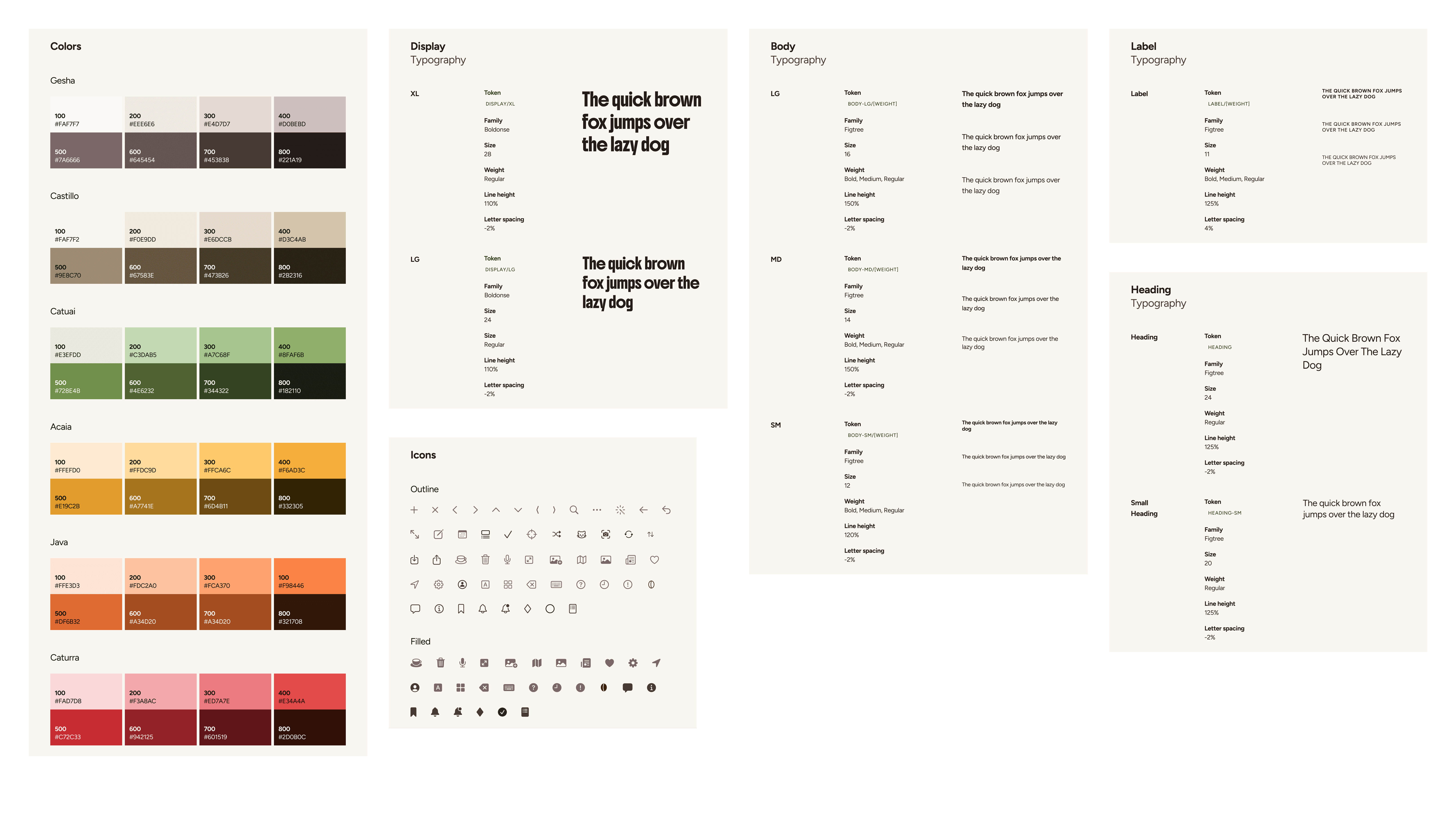
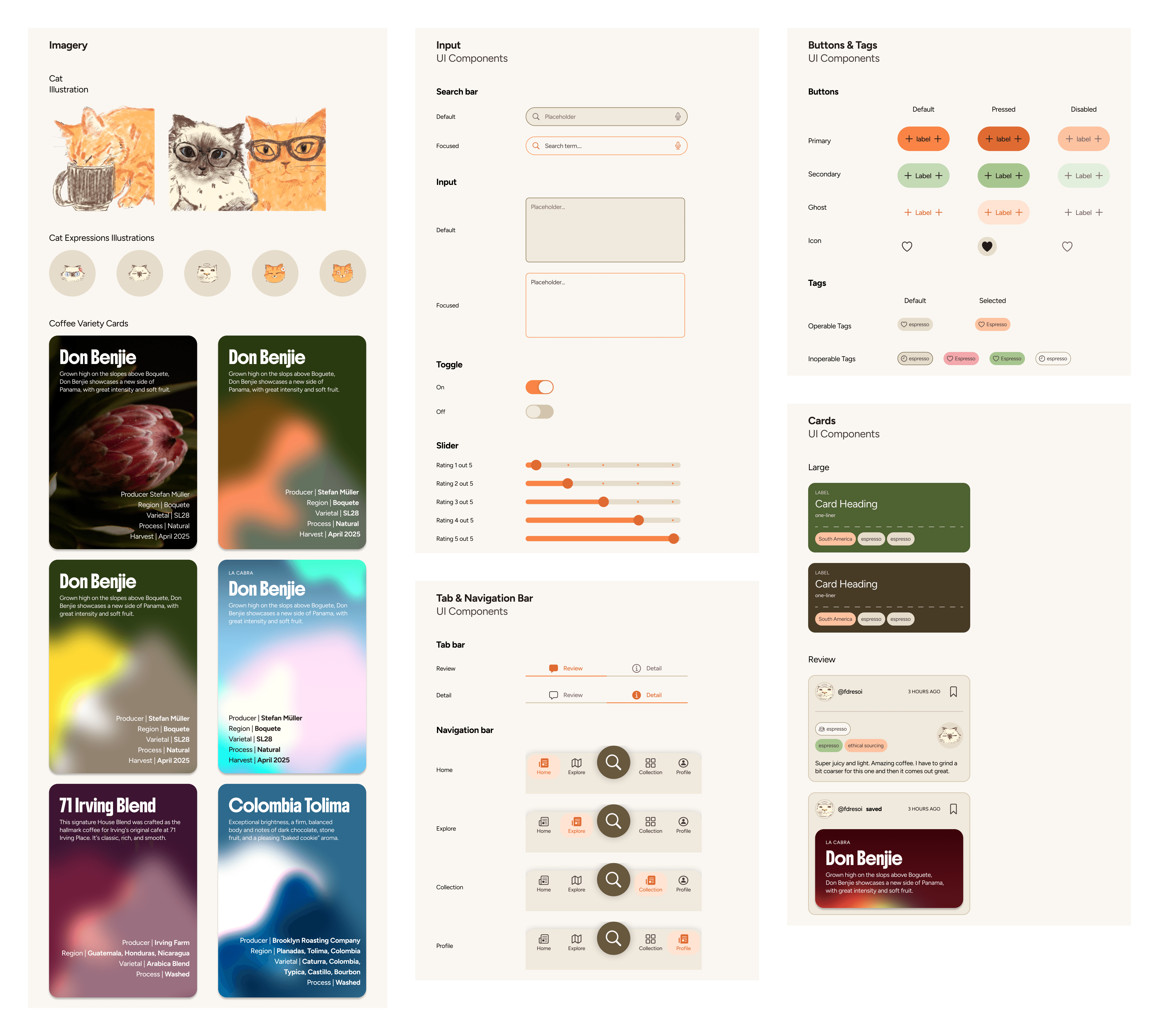
Cat mascots and cat facial expression ratings also are in place of conventional stars to keep the tone playful. To support this identity at scale, I built a design system of 80+ components following atomic design principles, ensuring visual consistency across every screen while leaving room to iterate quickly.
Setting Visual Identity
brevv's visual identity is rooted in the physical coffee cards that inspired the project: warm, tactile, and approachable. The color palette draws from coffee plants and cherries, with each tone named after a coffee variety, paired with a high-personality display typeface (Boldonse) and expressive body typeface (Figtree).
Cat mascots and cat facial expression ratings also are in place of conventional stars to keep the tone playful. To support this identity at scale, I built a design system of 80+ components following atomic design principles, ensuring visual consistency across every screen while leaving room to iterate quickly.
To validate decision decisions and visual identity, I conducted in-person usability testing with 6 participants using a think-aloud, task-based format.
The critical issues emerged from this directly help orient the iteration and final design.
To validate decision decisions and visual identity, I conducted in-person usability testing with 6 participants using a think-aloud, task-based format.
The critical issues emerged from this directly help orient the iteration and final design.
Design Highlights
Onboarding Flow
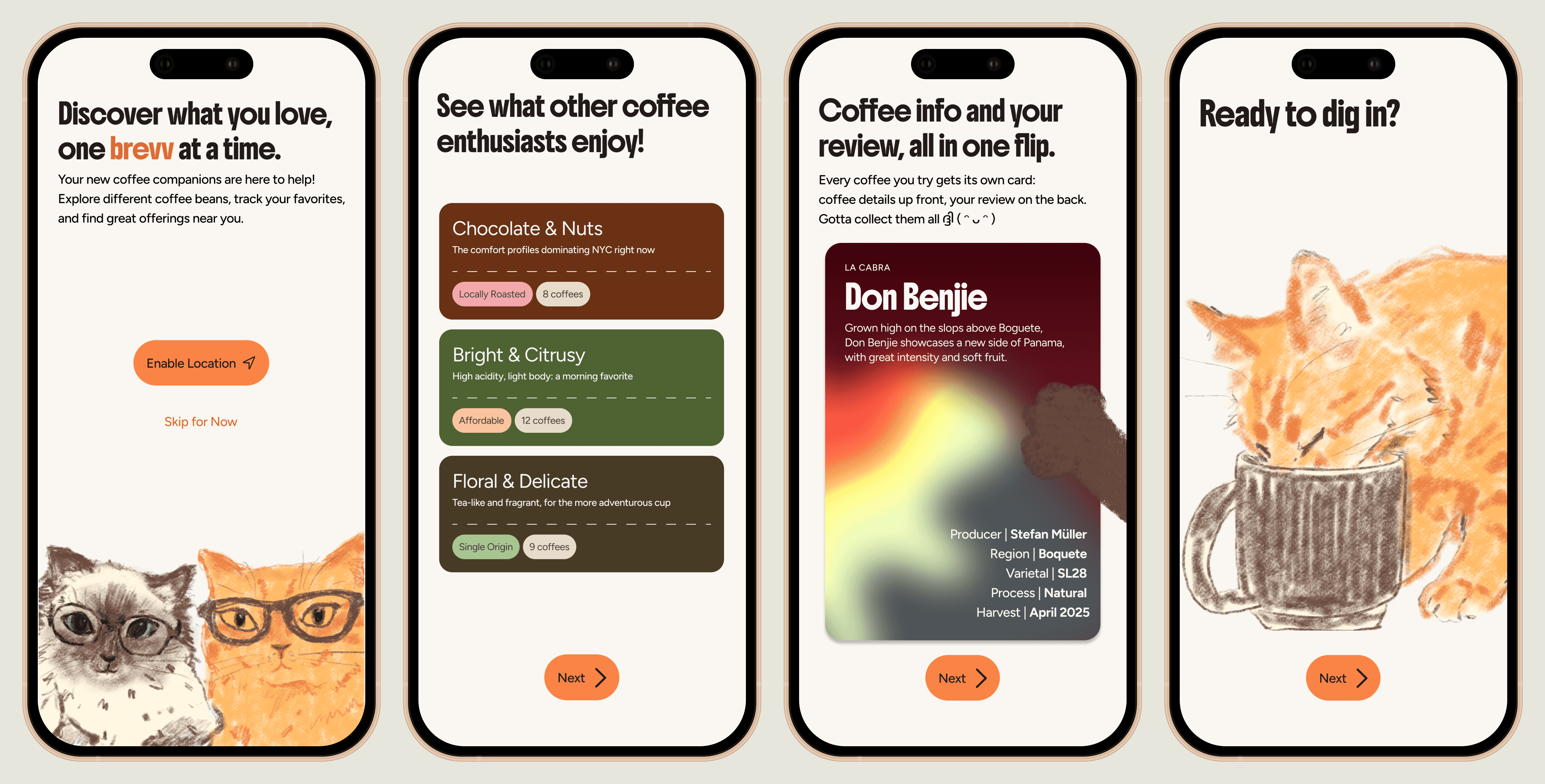
To address confusion about brevv's purpose that surfaced in testing, we introduced onboarding to:
establish the focus on coffee beans and tasting experiences upfront
introduce the mascots to set the visual tone, previews the location-based nature of the app, and
demo the coffee card system interactively so users arrive at the main experience already oriented.
Design Highlights
Onboarding Flow
To address confusion about brevv's purpose that surfaced in testing, we introduced onboarding to:
establish the focus on coffee beans and tasting experiences upfront
introduce the mascots to set the visual tone, previews the location-based nature of the app, and
demo the coffee card system interactively so users arrive at the main experience already oriented.
The Coffee Card System
This coffee card is brevv's core artifact that serves browsing, learning, and personal journaling all at once.
Each card renders coffee details immediately scannable.
When a user logs their own experience, the card flips and becomes a personal record of that tasting moment: capturing specific details for future reference.
The Coffee Card System
This coffee card is brevv's core artifact that serves browsing, learning, and personal journaling all at once.
Each card renders coffee details immediately scannable.
When a user logs their own experience, the card flips and becomes a personal record of that tasting moment: capturing specific details for future reference.

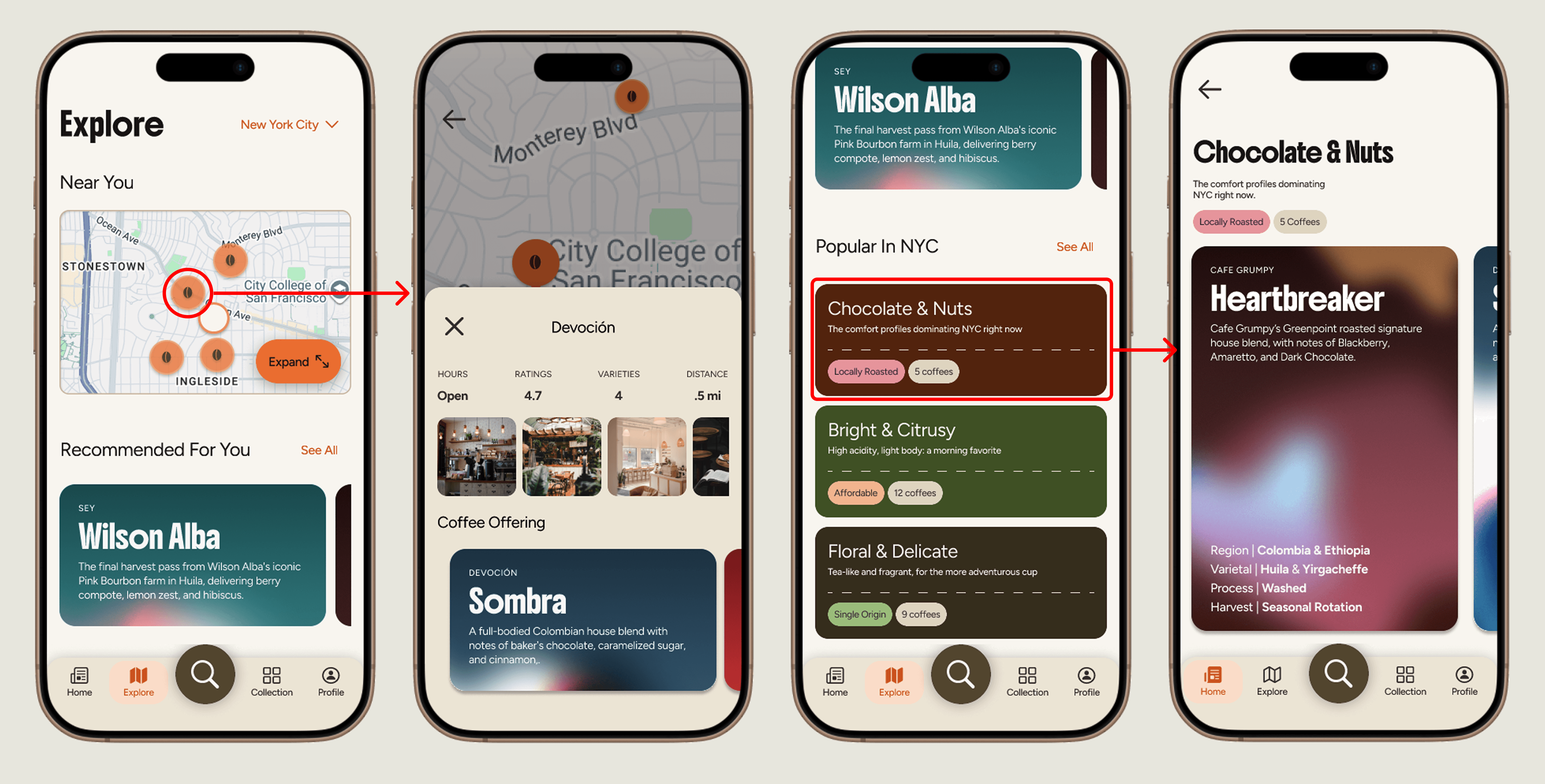
Multi-entry Discovery
Research revealed that users in dense urban areas wanted a better way to find new coffees near them, with more visibility for independent roasteries and cafes that tend to be overlooked.
In response, brevv offers map-based exploration, list views, and curated local collections, giving users multiple ways to discover what is nearby and surfacing independent and locally owned places that rarely show up in a Google search.
Multi-entry Discovery
Research revealed that users in dense urban areas wanted a better way to find new coffees near them, with more visibility for independent roasteries and cafes that tend to be overlooked.
In response, brevv offers map-based exploration, list views, and curated local collections, giving users multiple ways to discover what is nearby and surfacing independent and locally owned places that rarely show up in a Google search.
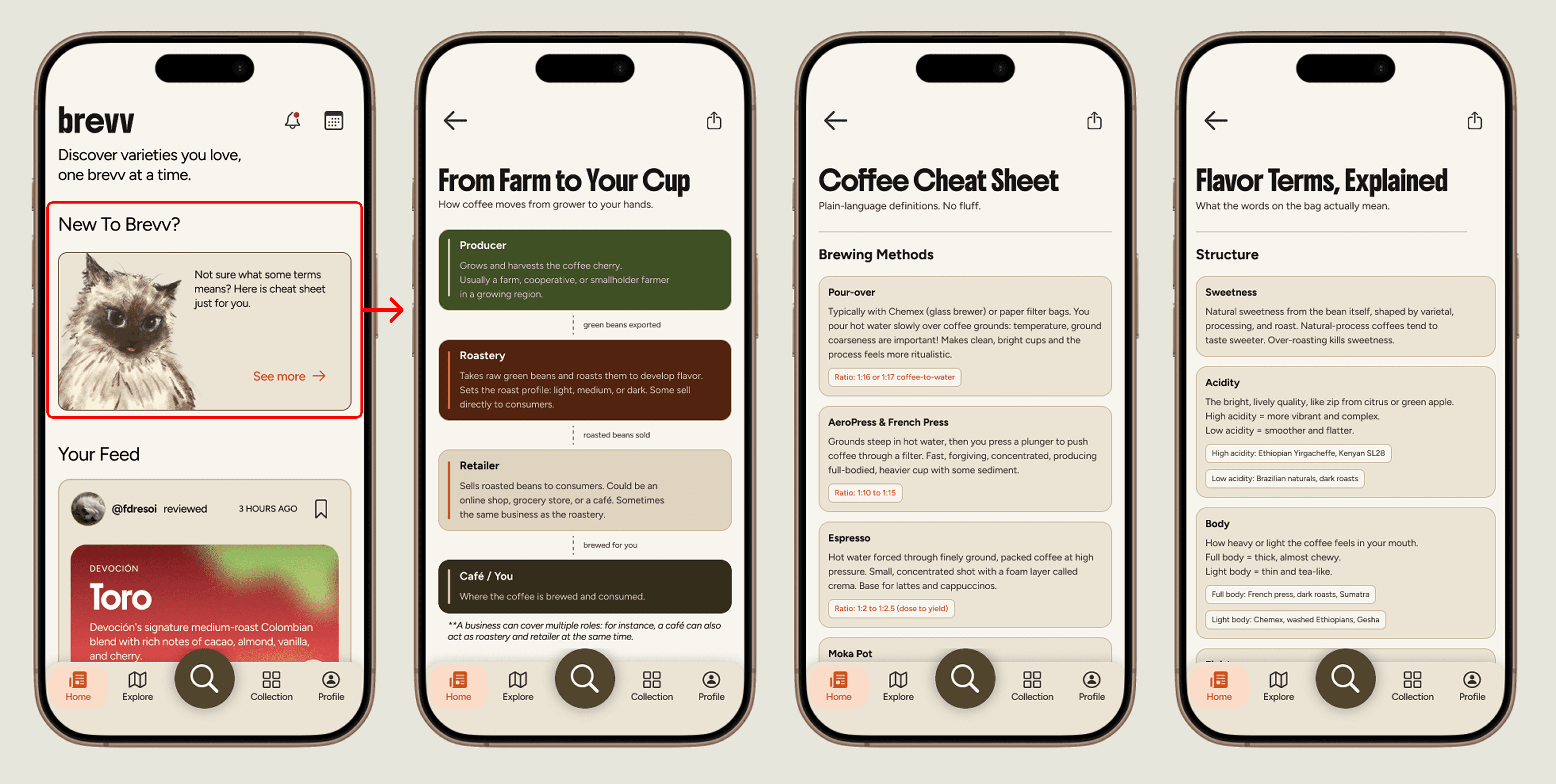
Educational Layer
The knowledge barrier was one of the most consistent findings across both research and usability testing. Users struggled with specialty coffee terminologies and during testing, many participants flagged moments where the app was not doing enough to help clarify.
Rather than front-loading information during onboarding, we designed an in-app educational layer that users can access when they need it. It surfaces core terminologies in plain language, meeting users at the point of confusion rather than assuming prior knowledge.
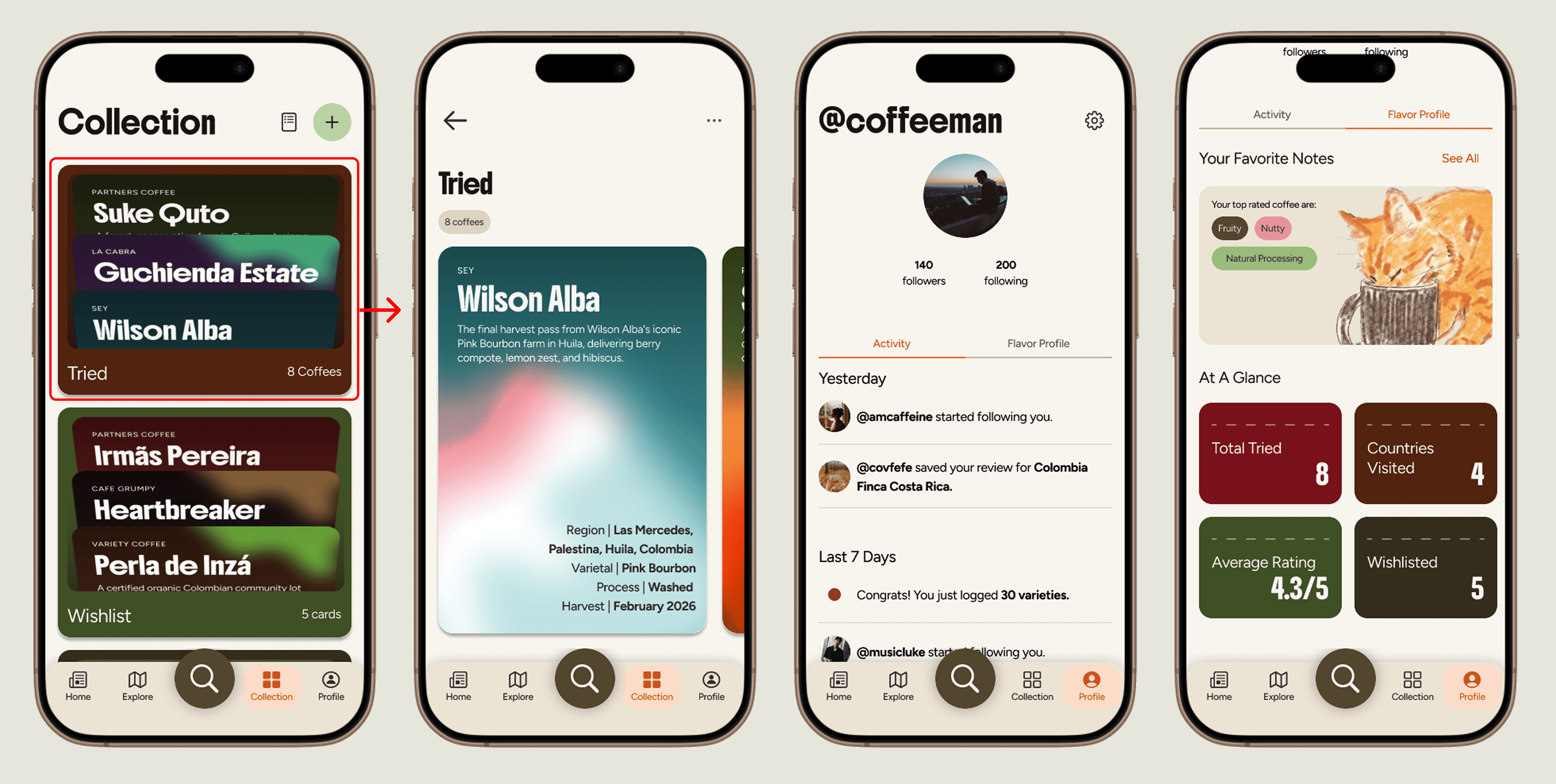
Personal Collection and Profile
Reviewed coffees build a personal collection that tracks taste over time.
A profile view adds a reflection layer with activity, favorite flavor-note patterns, and personal stats.
Educational Layer
The knowledge barrier was one of the most consistent findings across both research and usability testing. Users struggled with specialty coffee terminologies and during testing, many participants flagged moments where the app was not doing enough to help clarify.
Rather than front-loading information during onboarding, we designed an in-app educational layer that users can access when they need it. It surfaces core terminologies in plain language, meeting users at the point of confusion rather than assuming prior knowledge.
Personal Collection and Profile
Reviewed coffees build a personal collection that tracks taste over time.
A profile view adds a reflection layer with activity, favorite flavor-note patterns, and personal stats.
Next Steps
Complete the design of all remaining screens across the full information architecture to support the end-to-end experience.
Conduct a second round of usability testing with the final iterated design to validate key improvements.
Develop content strategy for the education layer, defining what gets surfaced, how it stays current, and how it scales.
Begin iOS development using SwiftUI and Claude Code, translating the design system into a working application.
Launch a closed beta version with a curated group of specialty coffee enthusiasts to gather real-world feedback before a wider release.
Next Steps
Complete the design of all remaining screens across the full information architecture to support the end-to-end experience.
Conduct a second round of usability testing with the final iterated design to validate key improvements.
Develop content strategy for the education layer, defining what gets surfaced, how it stays current, and how it scales.
Begin iOS development using SwiftUI and Claude Code, translating the design system into a working application.
Launch a closed beta version with a curated group of specialty coffee enthusiasts to gather real-world feedback before a wider release.
Key Learnings
🎨 Strong visual identity builds trust and orients users within the first few seconds.
Investing in a cohesive visual language early had a direct impact on how users perceived and navigated brevv.
✨ Research shapes what to build.
Cutting features based on research rather than assumption kept the product focused on the highest-value user needs and prevented overbuilding.
⚙️ Investing in a design system early creates compounding returns.
The 80+ component library made it possible to iterate quickly, maintain consistency at scale, and set a strong foundation for development.
Key Learnings
🎨 Strong visual identity builds trust and orients users within the first few seconds.
Investing in a cohesive visual language early had a direct impact on how users perceived and navigated brevv.
✨ Research shapes what to build.
Cutting features based on research rather than assumption kept the product focused on the highest-value user needs and prevented overbuilding.
⚙️ Investing in a design system early creates compounding returns.
The 80+ component library made it possible to iterate quickly, maintain consistency at scale, and set a strong foundation for development.
